Web Page Design Notes
2019 UPDATES
This is a brief summary of the process behind the (new) web pages on this site. There are many different ways to put together web pages and there also has been a lot of evolution within web page design and construction. In fact this web site has undergone many revisions since it first appeared on the Internet in 2001. I am not going to go back and re-write all of the older web pages on this site so you will see a mix of different structures for the older web pages. Here we discuss the details and reasoning behind the current generation. These ideas can be translated to other web sites, modified, expanded upon, etc. if desired.
Web Site Goals
- Simple minimalist code with minimal use of programming languages and scripts - for fast web page building and easy modification, and fast page loading
- Fast web page loading - provide a fast browsing experience for users, don't discourage visitors with slow-loading web pages
- Responsive design - reliably presenting the web pages in a proper visual manner across all different screen sizes and mobile devices (tablets, phones)
- SEO (Search Engine Optimization) - coded to produce the highest possible rankings for search terms
- Accessibility - best possible compliance with ADA and other guidelines
- Minimal cost - production and publishing of web site for the lowest cost possible
How It's Done
This test web page serves as a test page for measurements, compliance checks, and visual checks. It is built with the same code as all of the new web pages on this website.
Here are the technologies used for this website:
HTML5 is the latest web standard for producing the structure of a web page. CSS3 is the latest web standard for "marking up" the content of the web page, that is, formatting it to look the way you want. Barebones (based on Skeleton) is a "boilerplate" set of CSS tools that can be used to help construct and format your web page the way you want without having to write a lot of code. These 3 technologies represent the basic requirements for producing web pages while maintaining plenty of power and flexibility. There are many other technologies and programming languages such as JavaScript (JS) that can also be used, but these come with more complexity and learning curves. Here we keep it simple. The links above will lead to educational resources for using these big 4. The HTML code for this web page can easily be seen by using the View Source function on your browser. Here everything is kept as minimalist as possible and the page elements such as pictures are positioned using the built-in CSS grid elements within the Barebones CSS files.
Speed Performance
We want our web pages to load as fast as possible for the reader. A bloated and slow-moving web page that takes a long time to load will discourage visitors and they will bail out for other places in the giant world of the internet. So it's a good idea to check the page loading speed and make sure it is good. A nice tool for this is the GTmetrix Speed Test. Here is how it looks for this web page.
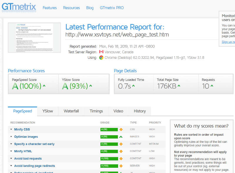
A key number here is the "Fully Loaded Time" which is 0.7 seconds. The entire web page loads in under one second which is plenty fast. GTmetrix provides an entire list of grades for all aspects of the web page and its hosting server, and also provides details on how to improve the different parts, and therefore the overall loading time. This test page has almost 100% grades for all items, but there are a few things that could be changed that would speed it up even more. For example, the 3 style sheets could be combined into one, and those style sheets could be "minified" by removing unnecessary text and comments (they even provide the minified code for you if you want it). But these steps can make it a bit more difficult to manage the style sheets, so given that the entire web page which includes pictures loads in under one second, it is fast enough.
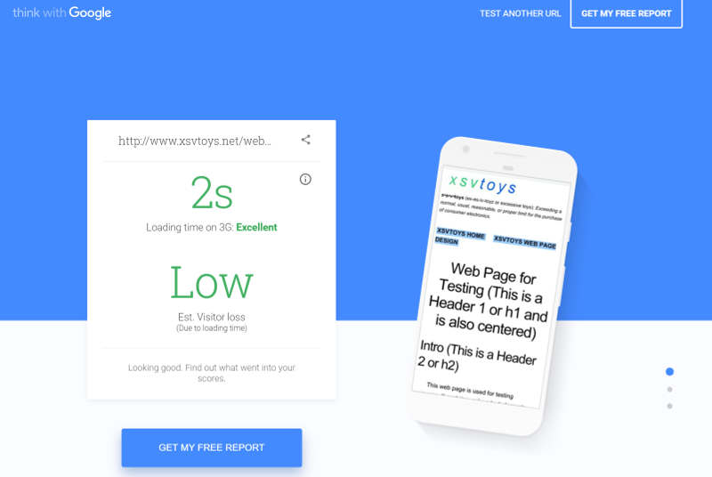
Here is another speed test run on the Google "mobile speed test". This confirms that your page loads quickly over cell phone signals (such as 3G) as well. The load time of 3 seconds falls into the Excellent area of the scale, confirming we have a nice, compact, and fast-loading web page.
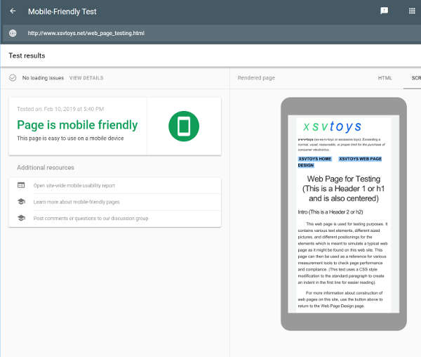
Responsive Design
Google also has a "Mobile-Friendly" test which you can use to test your responsive design. The responsive design is taken care of by the CSS in the Skeleton boilerplate and if everything is optimal then there will be a good result on this test, such as for our test page shown below. There are a number of other sites that offer testing for responsive design and mobile devices, but a better way is to load your web page on your smartphone and on a table such as an iPad and see if everything behaves properly and looks as it should.
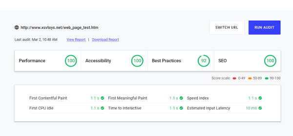
SEO Optimization
The Google web.dev page provides a SEO check along with other factors such as speed and accessibility. As shown here this page scores 100 for SEO structure. Google's webmaster web pages provide plenty of information about how to optimize for good SEO. The basic ideas are to make logically organized web pages and to post your own unique and useful information.
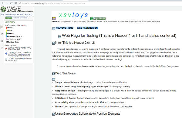
Accessible Design
The Webaim accessibility evaluation tool can be used to test a page for accessibility issues. As shown here this page has zero errors for the various accessibility parameters. The Webaim site and other resources provide information on how to meet accessibility requirements for web pages. The basic ideas are to make logically organized web pages and to properly label images with alt text tags. Note that these concepts are completely compatible with creating a tightly-coded design that is SEO optimized and responsive in design.