Web Page for Testing (This is a Header 1 or h1 and is also centered)
Intro (This is a Header 2 or h2)
This web page is used for testing purposes. It contains various text elements, different sized pictures, and different positioning for the elements which is meant to simulate a typical web page as it might be found on this web site. This page can then be used as a reference for various measurement tools to check page performance and compliance. (This text uses a CSS style modification to the standard paragraph to create an indent in the first line for easier reading).
For more information about construction of web pages on this site, use the button above to return to the Web Page Design page.
Web Site Goals
- Simple minimalist code - for fast page construction and easy modification
- Minimal use of programming languages and scripts - for fast page loading
- Responsive design - reliably presenting the web pages in a proper visual manner across all different screen sizes and mobile devices (tablets, phones)
- SEO (Search Engine Optimization) - coded to produce the highest possible rankings for search terms
- Accessibility - best possible compliance with ADA and other guidelines
- Minimal cost - production and publishing of web site for the lowest cost possible
Using Barebones Boilerplate to Position Elements
The "custom" CSS file defines all of the webpages to be 960 pixels wide, this is done by creating a Container and defining it to be 960 pixels wide and then putting all of the web page content in that container. The 960 width is a somewhat arbitrary limit that is set on how wide the web page will be on large high-resolution monitors. The web pages could be made totally responsive and allowed to fill any size monitor, but with modern monitors with 4k resolution this will cause a very wide web page if viewed full screen which will make the text lines awkward to read. So the 960 width established a limit on that width to keep the text easier to read on large monitors. Everything will still be responsive as the viewing device goes downward in size.
The positioning behaviors of this web page are easily tested. If you are on a big computer screen, shrink the browser window downward toward smaller sizes and observe how the text and pictures reposition themselves gracefully. For smaller screens such as tablets and smartphones, observe how everything will reposition themselves to always allow the easiest viewing experience for the user. For example, viewing on a smartphone in portrait orientation versus landscape is a very different form factor. This web page code will automatically display the pictures in the optimal way for each orientation.
Here are 3 images each 250 pixels wide by 150 pixels high. They are positioned using the Barebones grid DIV called CSS "grid-container thirds" which provides a simple way to align 3 things on the web page in a row.
Here are 2 images each 350 pixels wide by 200 pixels high.They are positioned using the Barebones grid DIV called CSS "grid-container halves" which provides a simple way to align 2 things on the web page in a row
Here is 1 image 800 pixels wide by 600 pixels high. It does not need any special grid formatting as a single element. The CSS for for a figure automatically centers it on the page.

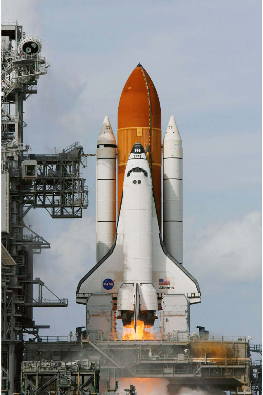
This is a fairly large JPG image of a photograph, 900 pixels wide by 1350 pixels high. This is here to "fill up" this web page a bit to make it similar to other pages on this site. Large images are often useful and visually pleasing but they can cause problems for web pages if they are too big in file size. The inclusion of this image here allows for more pertinent testing of this web page (Space Shuttle image from Wikimedia Commons).